All font rules are carefully set in the Elementor Global Settings panels. From H1 to H6, to regular body of text and several other instances that is often used on the site. There is a rule for Desktop, Tablet and Mobile. Note: if you edit the global settings, it will affect everywhere using the rule. So be very careful, and If you want to make a one off change somewhere, better edit the style directly there!
H1 Gilroy
H2 Gilroy
H3 Gilroy
H4 Gilroy
H5 Gilroy
H6 Gilroy
Body of Text using Gilroy. This is the regular text for paragraphs mainly. You can use this elsewhere too. Lorem ipsum dolor sit amet, consectetur adipiscing elit. Ut elit tellus, luctus nec ullamcorper mattis, pulvinar dapibus leo.
Featured Title using Funkydori
These titles are special ones, which will be set on case by case. Use the style panel of the element in question, there are no rules for these. The font is loaded in 1 instance only (as seen above here).
Product Grid
The different elements of the grid of products used on the Monthly Order page and the Permanent Shop. This is using the Product Loop, available in Template > Theme Builder. Note: Products without images will use the fallback image that is the logo. Products without prices will not display to the public.
The following colours come from the Brand Guideline PDF. These are you existing colours, identified in Hex colours, the web colours code.
#F9C93E
#FCDA84
#D15851
#9A6035
#FFFBE9
#005863
#1D1D1B
#575756
#9D9D9C
Web Colour System
The following colours are for the website. 3 Main colours dispatched across the 3 stores. Please remember that on the web we need extra colours for interactions. We are avoiding the use of pure black, and instead use a slightly less dark black for the text. (Text Colour).
Colours are set in Elementor Global Settings Panel. These affect all elements using them across the site, so changing it in the global settings will change everywhere on the site. To give an independent colour to an element, do not assign one of the preset ones, instead choose yours.
#F9C93E The Shop
#FAE064 The Shop (lighter)
#E2BC07 The Shop (darker)
#D15851 Monthly Offer
#D56761 Monthly Offer (lighter)
#B64C46 Monthly Offer (darker)
#005863 Our Subscriptions
#005863 Our Subscriptions (lighter)
#005863 Our Subscriptions (darker)
#1D1D1B Text Colour
#575756 Mid Grey Colour
#9D9D9C Light Grey Colour
#E9E9E9 Very Light Grey (hover)
#FBFBFB Very Light Grey
#FFFFFF White Backgrounds and Texts
#FFFBE9 Other possible background colour
Stores Titles
We can use each colour to identify the stores, directly from the titles. You can also use the colours as hover effect. (not shown here).
Monthly Offer
The Shop
Our Subscriptions
Site Buttons
The following rules apply to buttons on the website. We are using the 3 stores colour system on the buttons, plus the extra hover colours to signify interactions. In case the background already takes on the store colour, the button must be using the Very Light Grey and its hover colour (with black text).
The following rules apply to links embedded in body of text. It helps the user understand there is a link within a sentence, it should not be so distracting that it breaks the flow of reading.
Here is the link style using the same green as the Subscription store. Of course we can also bolden the link text when it is deemed necessary.
The Flipboxes are a good example of how the colour system works. Each store has its own colour backside, and the buttons are applied on the store background colour.
Note that this is a custom version of the Elementor Flipbox widget. It is saved as a template, available to place in other areas of the site if needed.
Here are all the product icons illustrating known features. This is dynamically displayed, so very likely to change with new or updated ones.
Cow
Ewe
Goat
Buffalo
Mix Milk
Milk Processing
Weight (unused)
Type
Season (unused)
Portion: Cut
Portion: Full
Taste (unused)
Special Diet
Year (wine)
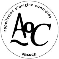
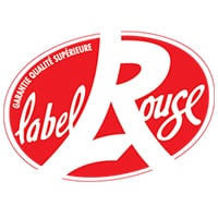
Certification Labels
Those labels are jpg images with a max size of 200x200px. They are dynamically assigned to products and display accordingly on the single product page and Quick View.
Note: Remember that retina screens require images with double the amount of pixels to display with the same resolution. So you should use a larger image than the set size in the page, to a ratio of 2.
AOC
AOP
DOP
IOP
PDO
PGI
EU Organic
Label Rouge
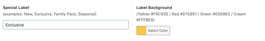
Special Labels
Those labels are displayed in the lower left corner of the product image on the grid of products, and on the upper left corner of the single product page. With direct input and not images, they are linked to 2 custom fields (available in the product backend page). 1 field for the name of the label, and the other to choose the colour of the background.
Note: those use the special font Funkydori.
New
Exclusive
Family Pack
Seasonal
Country Maps
Here are all the Country SVG maps (to date). They are inserted in the system via the “Product Icons” area. One post per entry. The name of the post should be the same as the name used in the product custom field. (otherwise it will not display).
Africa
Algeria
Cyprus
France
Greece
Italy
Spain
Switzerland
Turkey
UK
Regions Maps
Here are all the Regions SVG maps (to date). They are inserted in the system via the “Product Icons” area. One post per entry. The name of the post should be the same as the name used in the product custom field. (otherwise it will not display).
Appenzell
Apulia
Ardèche
Aube
Auvergne
Auvergne-Rhônes-Alpes
Aveyron
Bath
Beaujolais
Burgundy
Burgundy, Côte d’Or
Brittany
Cambridgeshire
Campania
Canton of Fribourg
Canton of Fribourg
Champagne
Corsica
Drôme
Emilia-Romana
Emme Valley, Bern
Emme Valley, Bern
Gevrey-Chambertin
Guijuelo
Haute-Savoie
Hauts-Doubs
Ile-de-France
Isère
Jura
Jura Mountains
Jura, Franche-Comté
Jura, Franche-Comté
Larissa
Loire Valley
Loire-et-Cher
Leicestershire
Nord-Pas-de-Calais
Normandy
Normandy, Camembert
Poitoux
Poitoux
Poitoux-Charentes
Poitoux-Charentes
Puglia
Pyrénées
Pyrénées-Atlantiques
Provence
Rhone-Valley
Rhone-Valley
Savoie
Savoie Beaufortain Valley
Savoie French Alps
Seine-et-Marne
Seine-et-Marne, Brie
Seine-et-Marne, Ile-de-France
Sicily
South West
South-West
Thierache
Image Specs
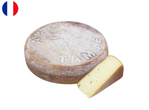
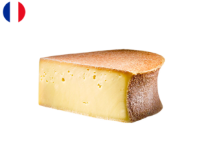
Product images are cutout and produced with transparency, the light grey background is added under to help contrast with the containing page. (this gives you flexibility down the line).
Home Banner jpg
1900 x 1000 pixels (desktop) 500 x 1000 pixels (mobile)
Flipbox
tbc… 72ppi – Jpg
Products
800 x 600 pixels 72ppi – Png transparent
Shop Cat. slider
180 x 160 pixels 72ppi – Jpg
Discarded
Transparency
no transparency especially on sticky backgrounds.
Centred Menu
The centred main menu was discarded except for the mobile version.
Page Titles
no page titles visible, the sticky top page titles were discarded at some point.
Footer Menu
No menu in the site footer.
Icons
Here are the icons no longer needed.
Vegetarian: No
Vegetarian: Yes
Fall
Taste
Maturing
Wine
Food
After months of trying differents cheeses, cold cuts, wines, sweets, you are officially a Cheese Master!
To show you our gratitude and that you are very special to us, this special VIP status gives you an exclusive access to our E-Shop at the Monthly Offer’s price, for a period of one year!
We may also provide you with other benefits along the way, like invitation to our private events and tastings.
Your Cheese Club Team
We use cookies to ensure that we give you the best experience on our website. If you continue to use this site we will assume that you are happy with it.